Feb, 26 - May, 26





7 DIGITAL products
We exist to provide independent, trustworthy journalism that helps our readers makes sense of a complex world.
Without a shared foundation, teams solved the same design problems independently—duplicating effort, creating inconsistencies across brands, and making every new feature harder to scale.
- Duplicate components across teams
- Slow, lossy design-to-code handoff
- Hard to scale new products
- Accessibility treated as afterthought
- Fragmented ecosystem
- Inconsistent experience across
This led to the decision to focus on establishing a robust design system to streamline the entire process and ensure long-term scalability
I led this 3-month project while working closely with my mentor, who provided guidance throughout the project.
Before the Pixels, the People
HT One will
HT One won’t
Bandwidth
Adopt incrementally, on each team's own release calendar
Require a big-bang migration
Product Identity
Keep brand color, imagery, tone, and editorial personality fully product-owned
Impose one visual identity or one color palette across all products
Scope
Own shared foundations only tokens, core components, accessibility baseline, interaction patterns
Own page layouts, content strategy, or feature decisions
Design Execution
Give teams flexible, themeable components — same button, infinite brand skins
Lock teams into rigid, fixed layouts with no room to adapt to context
Setting the stage

Check New UI visual adaptability
Find edge cases and resolve
Experiment New UI with main pages
New UI Check
Token Architecture
Naming Texonomy
Token Architecture
Support for Dark and Light mode
Theming
Design Phase 1 components
with UX enhancement
Documentation
Tracker and sync with Developers
Identify inconsistencies and gaps
Prioritize components with high impact
Full Product Audit
Audit and Findings
Understanding the Existing Design Landscape
Before defining new components, I audited the existing interfaces across HT's brand ecosystem to understand what was shared, what had diverged, and where duplication was creating unnecessary complexity.
This helped uncover repeated patterns, duplicated components, and inconsistencies in typography, colour, spacing, radius, and iconography.
A strong system starts with a strong foundation



COLOURS
The colour system lacked consistency across brands, resulting in visual fragmentation and increasing maintenance overhead.
I consolidated it into a structured, scalable colour system that preserved each brand’s identity while creating a consistent foundation for growth.
It now supports both light and dark modes, bringing clarity, consistency, and ease to every surface.
TYPOGRAPHY
Typography varied across products, with inconsistent type scales, weights, and hierarchy making the experience feel fragmented. I established a shared type system with clear semantic roles, creating a consistent foundation that could scale across brands and interfaces.
The inconsistent use of font sizes and weights disrupted visual hierarchy and made the interface feel unstructured.
Hierarchy
Weight
Size
Line Height
Display Large
Bold
44
56
Heading H1
Extrabold
28
36
Heading H2
Semibold
24
28
Heading H3
Extrabold
20
28
Heading H4
Semibold
18
24
Body B1
Regular
18
28
Body B2
Regular
16
24
Body B3
Regular
14
20
Body B4
Regular
12
16
Caption C1
Bold
14
20
Caption C2
Bold
12
16
ROUNDED, NOT RANDOM
Corner radius became another way to express brand personality. We established a structured radius scale that balanced consistency with each brand’s unique visual character.
Corner radius plays a key role in expressing the brand’s personality, whether it feels soft, bold, or modern.
8px
16px
20px
Flex icon set
Flex icons use smooth curves and a rational structure for consistency and legibility. Instead of strictly following a grid, they rely on optical corrections for a more natural and flexible appearance.
We want to use icons with unique look without compromising the legibility and simplicity.
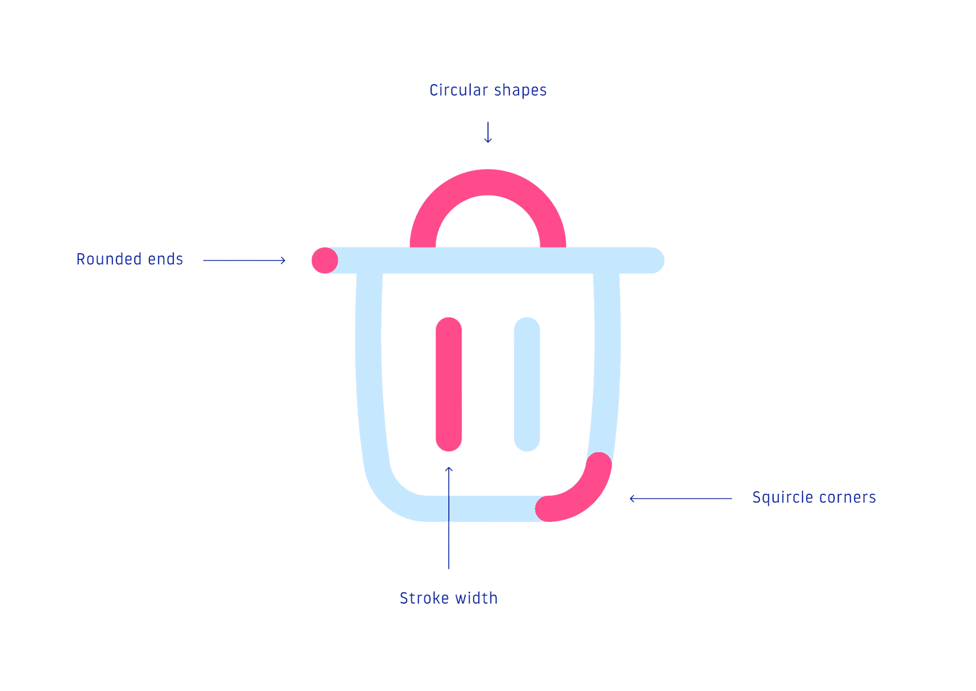
Squircle corners
Circular shapes
Rounded ends
Stroke width
SCALABLE TOKENS
#007AFF
blue-500
16 px
Raw value
Raw value
Token
Token
spacing-medium
We introduced a three-tier token architecture that separates foundational values from semantic meaning and brand expression. This created a clear bridge between design and code, making the system easier to theme, maintain, and scale across brands.
Reusable DNA OF A PRODUCT
Design <> Dev
A defined path, not a handoff cliff. Design tokens sync to code, components map one-to-one, and devs pull from the same source designers push to.
Tokens, components, and specifications stay connected, allowing designers and developers to work from the same source of truth.

Governance
A design system isn't shipped, it's maintained. Governance defines who owns it, how it changes, and how quality holds as more teams contribute.
To quantify design system adherence, we have used figma analytics tool and design system auditor
No.
Pages
Status
Remarks
#1(ICON)
Homepage (HOME)
In Progress
16.02.2026
#2
Section page
In Progress
14.03.2026
#2(ICON)
PREMIUM SECTION PAGE (PREMIUM)
In Progress
22.08.2026
#2(ICON)
TOPIC CATEGORY PAGES (search)
In Progress
22.08.2026
#3
ARTICLE DETAIL PAGE
Completed
27.02.2026
#3(ICON)
LATEST/Ai Summary page
Completed
27.02.2026
#4
Notfication menu
Completed
15.03.2026
#5
PROFILE MENU
In Progress
18.06.2026
#5.1
BOOKMARKS PAGE
In Progress
05.07.2026
#5.2
ABOUT US
In Progress
15.09.2026
#5.3
PRIVACY POLICY
In Progress
01.10.2026
#5.4
CONTACT US
In Progress
10.11.2026
#5.5
TERMS OF USE
In Progress
20.11.2026
#5.6
EXPLORE APPS
In Progress
30.11.2026
#5.7
HELP CENTRE
In Progress
05.12.2026
#5.8
EDIT PROFILE PAGE
In Progress
15.12.2026
#6(ICON)
E-PAPER PAGE (e-paper)
In Progress
01.09.2026
#8
VIDEOS PAGE
Completed
15.03.2026
#9
PHOTOS PAGE
Completed
27.02.2026
#10
HT BRUNCH
Completed
27.02.2026
#11
HT WKND
Completed
27.02.2026
#12
TRENDING PAGES
Completed
15.03.2027
#13
GAMES
Completed
02.03.2026
#14
INFOGRAPHICS LISTING PAGE
Completed
02.03.2026
#15
INFOGRAPHICS DETAIL PAGE
In Progress
05.01.2027
#16
ENTERTAINMENT PAGE
In Progress
05.01.2027
#17
OPINION PAGE
In Progress
05.01.2027
#18
NUMBER THEORY PAGE
In Progress
05.01.2027
Back